« News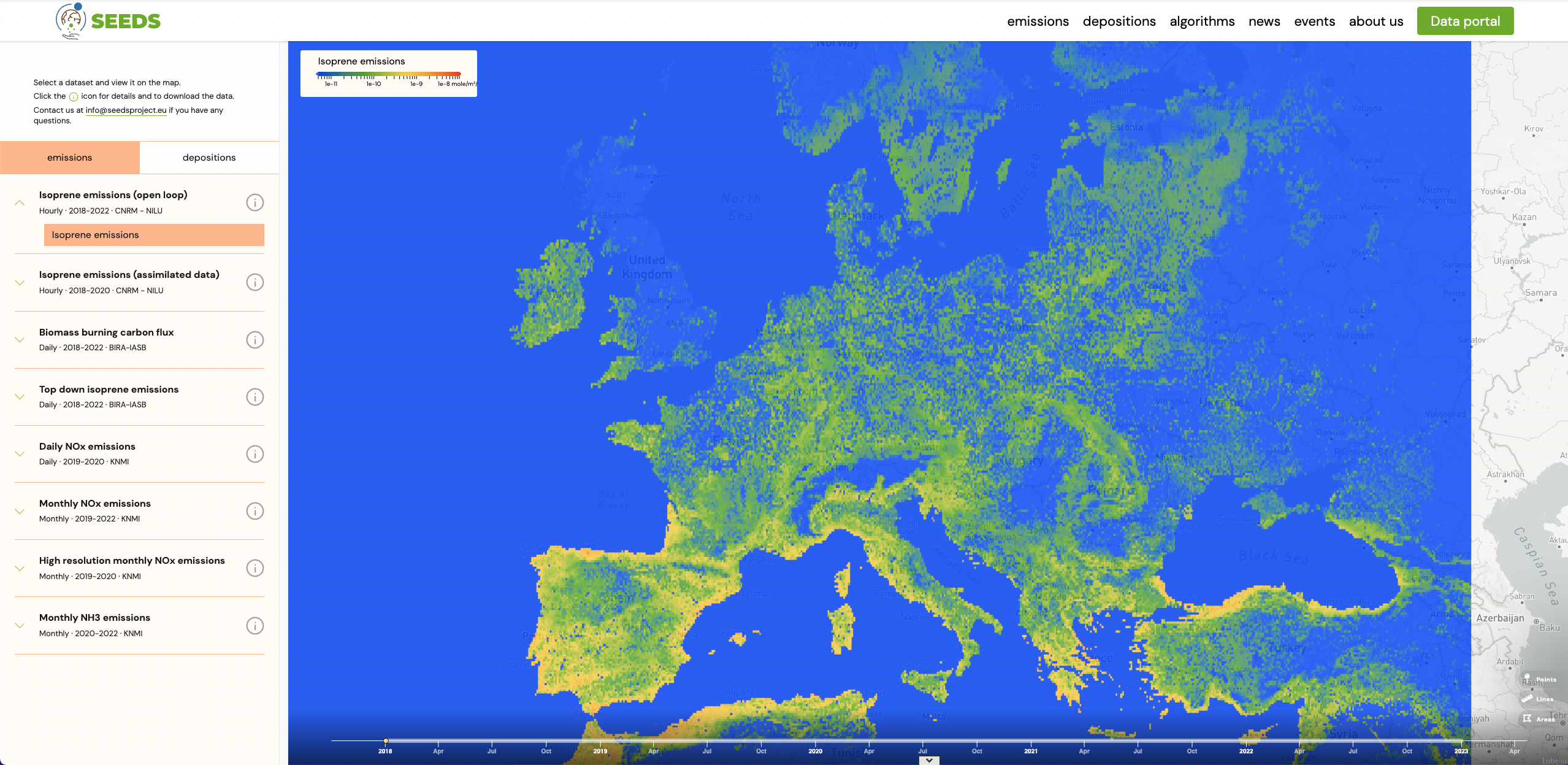
Developing the SEEDS data viewer, interview to Pau Moreno
2023-12-15T00:00:00.000Z
Pau Moreno works as a software engineer at Lobelia, an SME based in Barcelona specialised in satellite technology, computational intelligence and data visualisation for climate action. His role in this project is to implement and deploy the SEEDS website, and to build a harmonised repository of all the datasets produced within the scope of this project.
Can you briefly explain the purpose of deploying a data viewer in the SEEDS project ?
One of the goals of the project was to contribute to the broader progress of research in the field of top-down technologies for emissions and depositions, which are still in their early stages. Our online presence enables the consortium to openly share their findings. The website contains a Data Portal, which is the gateway to this data repository, and contains an interactive viewer to browse the data. Offering a full-fledged data viewer makes the SEEDS catalogue more discoverable. Users don’t need to download the data first to see how it looks, they can dive into the data just by using the viewer in the web portal.
Can you briefly explain what the Zarr structure is, and what is the advantage of using it here ?
Zarr is a data format that allows storing and serving n-dimensional data with a serverless architecture, meaning that there is no requirement for a dedicated API to serve the Zarr datasets, they just consist of static files residing in a cloud bucket. Having a serverless architecture reduces data serving maintenance costs, while at the same time making it easier for users to access the data without the need for API registration. Additionally, with no server bottlenecks, access is swift, and data availability remains consistently high from the user’s standpoint. The Zarr format is part of the OCG standard, and a whole ecosystem of associated tools is growing around it. Notably, It is compatible with Python’s Xarray data analysis library, and you can explore usage examples with this library in the SEEDS data portal.
How does the viewer render the data ?
The viewer directly renders the data, taking advantage of a key feature of the Zarr data format, which involves data chunking, i.e., splitting the data into smaller parts, with each part being an individual binary file in the cloud. In the SEEDS platform, Zarr datasets are stored in two different chunking schemes: one is map-optimised, where each chunk contains the entire geographical domain of the dataset, but only a few points in time, and the other is time-optimised, where conversely, each chunk contains a large amount of points in time, but a small portion of the geographic domain. Data chunking has been tuned so that each chunk (each individual data file) is around 1MB size. The SEEDS web viewer fetches the binary data chunks and renders the maps and time series on the user’s side, eliminating the need for a web mapping server, like a WMS / WMTS server. The chunk size of about 1MB ensures high performance of the viewer, as it requires only a minimal data load to generate maps or time series.
What was the main challenge you encountered while building the platform?
The main challenge that I faced when implementing the data portal for the SEEDS project was the heterogeneity of the datasets to be incorporated into the catalogue, including their varying sizes. Our objective was to provide all SEEDS project data in a harmonized format, ensuring consistency in terms of dimension names, coordinate format, and dataset naming conventions, regardless of the source of the dataset. Standardising the formats of all the data we received has required substantial effort, but now we are very glad to offer a data catalogue with a highly consistent and predictable format.
Which are your final steps for the development of the data viewer before the end of SEEDS this December ?
In this final year of the SEEDS project, our focus has been on enhancing the viewer’s user experience. This has involved refining colour maps for certain datasets and expanding the range of available plot types. For now, we only display time series, but introducing histograms for selected areas could also be an interesting improvement.